He maha ngā huarahi hei whakapai ake i tō paetukutuku mō te wheako pūkoro
- Tauira Paetukutuku Waea Pūkoro Urupare (E taunakitia ana)
- Tauira Paetukutuku Pukoro Motuhake
- Whakawehea Nga Paetukutuku Waea Pukoro
Ngā Tauira Paetukutuku Waea Pūkoro Urupare
He huarahi rongonui ngā tauira urupare i roto i te umanga hoahoa tukutuku, nā te mea kāore e taea e ngā CMS katoa te whakarato i tētahi kōwhiringa tauira pūkoro motuhake. Ko te hoahoa urupare ko te tikanga kua hangaia te tauira kia rerekē te āhua i roto i ngā whānui pūtirotiro rerekē. He uaua pea ngā tauira urupare mā ngā kaiwhakamahi ki te whakatika i a rātou anō, nā te mea me hanga motuhake ia huānga.
Hei tauira, ka whakapotohia pea ngā tahua, ka nekehia rānei ki waho o te whārangi, ka tangohia mai ina hiahiatia. He puhoi ake te tango i ngā paetukutuku arotau i runga i ngā taputapu pūkoro, nā te mea me tango e te taputapu pūkoro ngā momo/kaupapa katoa e whakamahia ana i te putanga papamahi, ahakoa kāore i whakamahia i te putanga pūkoro. Ko ētahi kaihoahoa tukutuku e aro ana ki te hanga tauira ātaahua, engari ka wareware rātou ki ēnei take tere tango.
Mena he paetukutuku tūruhi tō paetukutuku, tera pea kei waho ō kaihoko i ngā taha o te kapinga waea pūkoro, ā, tera pea ka raru rātou ki te tango i ngā whare pukapuka JavaScript me CSS katoa kāore e hiahiatia ana mō te wheako waea pūkoro. He puhoi te tango i ngā tauira urupare, engari kei te kaha mātou ki te hanga i ā mātou tauira urupare hou kia tere rawa atu, ā, ka toru ngā wā ka tere ake te whakaputa o ā mātou tauira urupare i te kaupapa WordPress toharite. Ka taea te whakarite i ā mātou paetukutuku urupare ki ngā tae rerekē, momotuhi, me ngā whakaahua.
Ngā Tauira Paetukutuku Waea Pūkoro Motuhake
Ko te tauira paetukutuku pūkoro i whakatapua ko te huarahi tuku iho i whakaratohia e matou he hototahi whakamuri mo o maatau paetukutuku papamahi katoa hei tuku wheako waea ki a raatau kaihoko. He rite tonu te mapipae whakaterenga a te tauira waea pūkoro, he rite tonu nga ihirangi ki to paetukutuku papamahi. Heoi, i whakakorea e matou nga marumaru katoa kia kore ai e taea e o kaihoko te tiki tere ki nga korero e hiahia ana ratou. Hei tauira, whakatere ki o taipitopito whakapā, tirohia te hononga mahere, tirohia ranei o hua me te hoko ngawari ki o raatau mata iti. I te roanga o te wa kua taapirihia e matou nga kara, nga waitohu me nga momo miihini i rite ki nga tae ki to tauira papamahi. Ma te pai o te whakatika ki to hoahoa tauira pūkoro whakatapua, ka whai wheako whakamataku o kaihoko, na te mea ko tenei tikanga te kōwhiringa tere mō ngā kiritaki e whakamahi ana i ngā hononga pūkoro puhoi o te taiwhenua.
Whakawehea Nga Paetukutuku Waea Pukoro
Ahakoa he paetukutuku katoa i hangaia mō te waea pūkoro anake, tera pea ka tino pai te wheako waea pūkoro i te tīmatanga, engari i te nuinga o te wā, ka wareware te kaiwhakahaere tukutuku ki te pupuri (kaore rānei e taea te pupuri), ā, ka kore e taurite ngā mōhiohio i roto i ia paetukutuku. Mena kei te whakahaere koe i tētahi pae hokohoko ipurangi, me whai pūkaha kotahi te wheako waea pūkoro me te wheako papamahi. Ka tohutohu mātou ki ō mātou kiritaki kia kaua e whakamahi i tēnei huarahi.
Tā Mātou Kaupapa Tino Rongonui
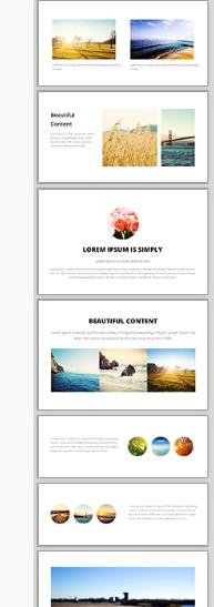
Ko te tauira Metro te kaupapa rongonui i whiriwhiria e ō mātou kaiwhakamahi i tēnei wā. Mā te papamuri mā māmā, me ngā whakaahua nui ataahua, ka taea e koe te hanga i tētahi paetukutuku ātaahua.
Ko te ID Tauira Iti: 114657 he rite tonu te ahua i roto i te aratau pūkoro whakatapua, aratau whakautu ranei.

Te whānuitanga o ngā tauira
He whānui ā mātou tauira urupare i runga i ngā mata nui, he tika i runga i ngā mata iti, ā, he tere, he ataahua hoki i runga i ngā mata waea pūkoro iti rawa.
Ka taea e koe o maatau tauira urupare te whakarite:
- Panui Whakakorikori
- Moko, Ingoa Pakihi ranei
- Te whakahōputu ihirangi whai rawa mā te whakamahi i ngā Etita Tōia-taka me te Pouaka Ihirangi
- Whakaahua Papamuri, Tae, Kakano ranei
- Katoa nga tae ka taea te kowhiri
- Nga momotuhi ritenga, te rahi me te mokowhiti raina

Me pēhea te huri i tō paetukutuku o nāianei ki tētahi tauira urupare
He maha ā mātou tauira urupare rerekē hei whiriwhiri māu. Kei te whakahōu tonu mātou i ngā wā katoa. Ina huri koe ki tētahi tauira urupare, ka whakahōuhia ō tahora papamahi me ō tahora waea pūkoro.
- I roto i te CMS, haere ki te ripa HOAHOA
- Tīpakohia HUIA KAUPAPA
- Tirohia ngā kaupapa katoa, ā, kia mōhio ki te pātene RESPONSIVE, ki te pātene WAEARANGI rānei. Mā tēnei pātene ka taea e koe te arokite i te kaupapa i roto i tētahi o ngā aratau. Ko ngā kaupapa me te pātene RESPONSIVE anake ngā tauira urupare.
- TĪPŌHIA he kaupapa hei haere tonu.
- Wetekina ngā pouaka mō te huri i te haki, te waitohu, te papamuri me ngā tae, mēnā kei te pirangi koe kia mau tonu ngā huānga o tō waitohu.
- Tohua te pouaka ki te whakahoki i o tautuhinga hoahoa tawhito, mena ka he.
- Tiakina te huringa kaupapa.
- I etahi wa ka arokite koe i to paetukutuku i muri i te huringa kaupapa, kaore pea i te tika te ahua, na nga tautuhinga keteroki tirotiro. Ka hiahia pea koe ki te PUBLISH me te whakawātea i to keteroki tirotiro, kia kite tika ai to paetukutuku.
- I ētahi wā, me tāpiri anō ō tautuhinga tae mō ngā tahua me ētahi atu, nā te mea ka whakaratohia e ētahi tauira ngā tae taunoa, ko ētahi kāore, kāore rānei ō huinga tae e hototahi tonu ki te tauira, ā, me whakatikatika pai pea.
Me pēhea te whiriwhiri i tētahi tauira waea pūkoro hou kua whakatapua
E 8 a matou tauira pūkoro motuhake, engari ka whakamahia e ia nga tae me te momotuhi mai i to kaupapa papamahi.
- I roto i te CMS, haere ki te ripa HOAHOA
- Tīpakohia ngā TAUIRA WAEMA
- pawhiria he TAHUA KAUPAPA HOU
- Tirohia ngā kaupapa katoa, ā, kia mōhio ki te pātene RESPONSIVE, ki te pātene WAEARANGI rānei. Mā tēnei pātene ka taea e koe te arokite i te kaupapa i roto i tētahi o ngā aratau. Ko ngā kaupapa me te pātene RESPONSIVE anake ngā tauira urupare.
- TĪPŌHIA he kaupapa hei haere tonu.
- Wetekina ngā pouaka mō te huri i te haki, te waitohu, te papamuri me ngā tae, mēnā kei te pirangi koe kia mau tonu ngā huānga o tō waitohu.
- Tohua te pouaka ki te whakahoki i o tautuhinga hoahoa tawhito, mena ka he.
- Tiakina te huringa kaupapa.
- I etahi wa ka arokite koe i to paetukutuku i muri i te huringa kaupapa, kaore pea i te tika te ahua, na nga tautuhinga keteroki tirotiro. Ka hiahia pea koe ki te PUBLISH me te whakawātea i to keteroki tirotiro, kia kite tika ai to paetukutuku.
- I ētahi wā, me tāpiri anō ō tautuhinga tae mō ngā tahua me ētahi atu, nā te mea ka whakaratohia e ētahi tauira ngā tae taunoa, ko ētahi kāore, kāore rānei ō huinga tae e hototahi tonu ki te tauira, ā, me whakatikatika pai pea.

Ngā Tohutohu mō ngā Ihirangi Urupare Waea Pūkoro
Ki te hiahia koe ki te wheako kaiwhakamahi pai rawa atu mō ngā taputapu pūkoro, me aro hoki ō ihirangi ki ngā taputapu pūkoro. He maha ā mātou kiritaki kua whakamahi i tā mātou aratau ētita TinyMCE tawhito hei waihanga i ngā hanganga ripanga uaua, me te maha o ngā rarangi me ngā pou hei whakatakoto i ngā whakaahua me ngā tuhinga. Kāore tēnei momo tahora e whakarerekē aunoa ki tētahi mata whānui iti, ā, ko ētahi o aua ihirangi ka tapahia, ka hiahiatia rānei he pae panuku hei uru atu.
Ko te ētita ihirangi pai rawa atu mō ngā ihirangi arotau ataahua ko tā mātou ētita Tōia me te Tuku. Tirohia ngā wāhanga poto kei te taha matau. Tōia ēnei kua tapahia ki roto i tō rohe ihirangi, kātahi ka whakatika i te tuhinga, ngā whakaahua me ngā hononga.
E mohio ana enei widget whakaatu me pehea te whakatika aunoa i a ratau ki roto i te tahora tapapa ataahua i runga i te mata whaiti.
Ihirangi Whakautu Ake
Ko nga mea katoa i hangaia e te punaha kua whakatikahia mo nga whakatakotoranga urupare waea. Kei roto i tenei ko:
- Pahūake Whakaaturanga Kiriata 95% teitei te whanui
- Ngā Kete Hokohoko me ngā Whārangi Utu
- Puka Uiui
- Ngā Puka Mema
Ki te kitea e koe tētahi ihirangi i hangaia e te pūnaha kāore e āhua tika ana i roto i tētahi tauira waea pūkoro urupare, tena koa whakamōhio mai ki a mātou, ā, mā mātou e whakatika i te wā e taea ai.
Te Whakarerekē i tō CSS kia Āhei ki te Waea Pūkoro
Mena he tangata hangarau koe, he pai pea ki a koe te huri i tō tauira o nāianei ki te aratau CSS arotau.
Rapua nga rarangi kei roto i to pepa ahua me nga rahi nui rawa atu o te 600px, 750px, 900px ranei:
# ipu {whanui: 750px; tawhē: 0 auto; }
Ka huri kia penei, ka whakakiia te 90% o te whanui o te mata tae atu ki te 960 teitei.
# ipu { te whanui: 90%; teitei-whanui: 960px; tawhē: 0 auto; }
Kātahi ka kimihia ngā pou, ka whakarerekē i ō rātou whānui, i ō rātou tawhā rānei mai i ngā whānui pumau, ki ngā whānui %, engari whakamahia noa aua whānui ina tautokona e te whānui o te mata. Ina iti iho te whānui o te mata i te 600px, ka whakarārangihia ngā pou ki roto i te whānui katoa o te pūtirotiro.
@pāpāho (whānui-iti: 600px) { .leftPou { whānui: 20%; mānu: maui; }
Tuhinga o mua i tenei wharangi:
Ae, ka whakaatu aunoa ā mātou paetukutuku katoa i tētahi tirohanga pūkoro kua arotauhia mō tō paetukutuku mō ngā whakatakotoranga pūkoro noa katoa.
Kei te huna katoa nga maru o to aratau papamahi, ka aro ki te ihirangi me te whakatere tuatahi. Ko te kōwhiringa taunoa he "tauira waea" motuhake e whakaatu ana i nga ihirangi rite katoa, ma te whakamahi i te mahere pae rite ki to putanga papamahi katoa. Ma te taunoa he maamaa te ahua o te tauira pūkoro me te ngawari ki te whakatere me nga maihao nui i runga i te mata iti.
- Ko nga rarangi me nga taiwhanga katoa ka huri ki nga huānga ngawari ka taea te panui.
- Ka uru ngā whakaahua ki te rahi o te mata.
- Ka taea te uru atu ki te tahua matua mā te pēhi i te pātene TAHUA kotahi kei te kokonga matau o runga, mā te panuku rānei ki te pito o te whārangi.
- He pouaka rapu kei te mutunga o nga wharangi katoa
- Kua rua te rahi o ngā āpure tuhinga me ngā āpure tāuru i runga i ngā waea pūkoro taumira teitei, he mata 720px te rahi.
- Ma te paatene "pae katoa" ka whakahoki te kaiwhakamahi ki te wheako papamahi.
- Whakaritea ano te aratau pūkoro taunoa me o ake tauira ritenga, me whakauru ranei nga kara me nga tae me nga momo.
- Monokia te aratau pūkoro, ā, whakaaturia tō putanga papamahi ki ngā pūrere katoa (he pai mō ngā tahora papamahi māmā)
- Monokia te aratau pūkoro me te hanga i to ake tauira CSS urupare
- Monokia te aratau pūkoro ka kowhiri i tetahi hoahoa urupare mai i ta maatau awhe tauira (titiro mo te kupu matua whakautu)
- Kāore te aratau pūkoro e whakamahia ana i runga i ngā iPad, i ngā taputapu hōputu nui rānei, ina ko te wheako mata katoa te mea pai. Engari, nau mai haere mai ki te whakarerekē i tēnei mā ō ake ture urupare.
- Kāore te aratau tauira pūkoro e aunoa ina tirohia he pae whakamātautau mā te waea pūkoro, engari ka taea e koe te tiro i te aratau whakamātautau mā te CMS i raro i ngā kōwhiringa hoahoa, ngā tauira pūkoro, te tiro aratau pūkoro.
- Kua honoa te aratau tauira pūkoro ki tō rohe ora, ā, ki te whakahohea, ā, ina ōrite ki tētahi rārangi momo waea pūkoro e mōhiotia ana, ka tukuna aunoatia rātou ki te aratau pūkoro i runga i te rohe turanga kotahi.
- Kāore e arohia ngā whārangi kua whakaputaina i te aratau pūkoro, mā ngā rārangi me ngā tahua katoa koe e ārahi ki tētahi whārangi ora hihiri ka pai ake te whakaatu i runga i te pūkoro.
- Ko nga hononga ki nga wharangi kua whakaputaina i roto i nga ihirangi o nga wharangi ka tukuna ano ki te putanga kua whakaputaina (kaore i te aratau papamahi).
- Ko te painga o tā mātou Aratau Pūkoro he tere te tango me te whakaatu i ngā ihirangi ki ngā taputapu pūkoro katoa, ahakoa kei roto koe i tētahi rohe tawhito e kapi ana te whatunga 2G. Kāore tā mātou aratau pūkoro e kikī ana i ngā kōnae javascript e 30 kāore koe e whakamahi.
- Ko tā mātou arotahi matua he hoatu ki te kiritaki te wheako kaiwhakamahi pai rawa atu kia taea ai e rātou te whakaoti i te hoko me te kore e hiahia ki te whakanui me te whakaiti i te maha o ngā wā i te wā e utua ana te kete hokohoko. Nā konei i whakaitihia ai e mātou ngā pānga e whakamahia ana i te aratau pūkoro.