有很多方法可以让你的网站在移动设备上获得绝佳的体验。
- 响应式移动网站模板(推荐)
- 专用移动网站模板
- 完全独立的移动网站
响应式移动网站模板
响应式模板是网页设计行业中一种流行的设计方法,因为并非所有内容管理系统 (CMS) 都能提供专门的移动模板选项。响应式设计意味着模板经过特殊设计,能够根据不同的浏览器窗口宽度自动调整布局。由于每个元素都需要单独设计,用户自行编辑响应式模板可能会比较困难。
例如,菜单可能会被精简,或者移到页面外,并在需要时再显示。响应式网站在移动设备上的加载速度通常较慢,因为移动设备需要下载桌面版中使用的所有样式/主题,即使这些样式/主题在移动版中并未使用。一些网页设计师专注于制作美观的模板,却忽略了这些加载速度问题。
如果您的网站面向旅游用户,您的客户可能身处手机信号覆盖范围之外,他们可能难以下载所有移动端体验不需要的额外 JavaScript 和 CSS 库。响应式模板的下载速度通常较慢,但我们一直在努力提升新响应式模板的加载速度,其渲染速度比普通 WordPress 主题快约 3 倍。我们的响应式网站支持自定义颜色、字体和图片。
专用移动网站模板
专用的移动网站模板是我们为所有桌面网站提供向后兼容性的传统方式,旨在为您的客户提供移动体验。移动模板使用与桌面网站相同的导航站点地图和内容。但是,我们精简了所有不必要的元素,确保您的客户能够快速找到所需信息。例如,他们可以轻松地在小屏幕上访问您的联系方式、查看地图链接或浏览产品并进行购买。随着时间的推移,我们添加了横幅、徽标,并自动匹配了与桌面模板相同的颜色。通过对专用移动模板设计的精细调整,您的客户将获得绝佳的体验,因为这种方法是…… 最快的选择 适用于使用速度较慢的农村移动网络连接的用户。
完全独立的移动网站
专门为移动设备打造的网站或许一开始能带来非常好的移动体验,但网站管理员往往会忘记维护(或者根本无力维护),导致两个网站的信息不同步。如果您运营的是在线购物网站,那么您的移动端和桌面端体验必须使用同一个购物车引擎。我们建议客户不要采用这种做法。
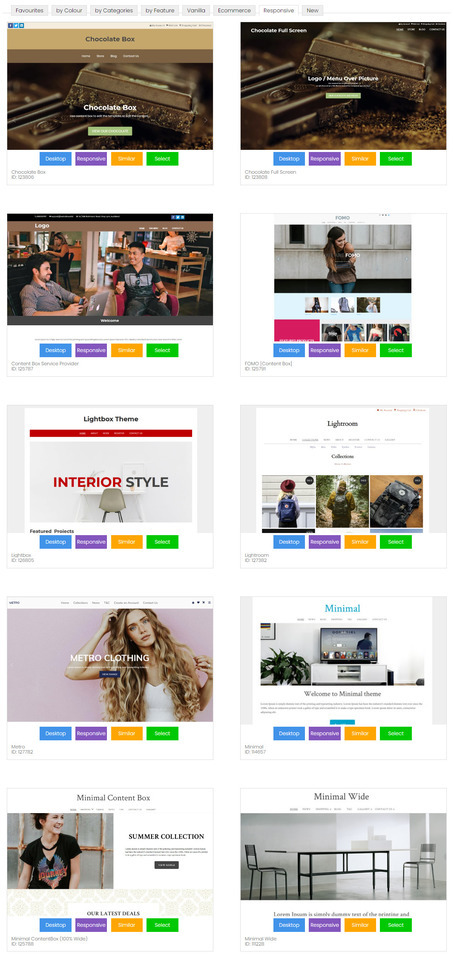
我们最受欢迎的主题
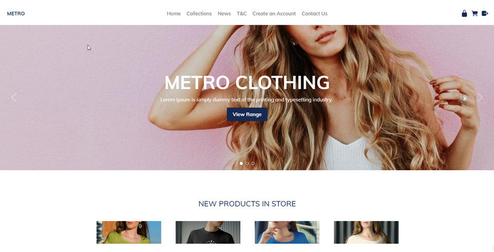
Metro模板目前是我们用户选择最多的主题。它采用简洁的白色背景,搭配精美的大图,可以打造出美观的网站。
最小模板 ID:114657 在专用移动模式或响应式模式下外观几乎相同。
模板范围
我们的响应式模板在大屏幕上宽广,在小屏幕上大小合适,在最小的移动屏幕上快速且美观。
您可以自定义我们的响应式模板:
- 动态横幅
- 标志或公司名称
- 使用拖放式编辑器和内容框编辑器进行丰富的格式设置
- 背景图像、颜色或纹理
- 所有颜色均可选择
- 自定义字体、字号和行距
如何将现有网站转换为响应式模板
我们提供多种响应式模板供您选择,并且会不断更新。切换到响应式模板后,您的桌面和移动设备布局都会同步更新。
- 在内容管理系统中,转到“设计”选项卡
- 选择“更改主题”
- 浏览所有主题,并留意“响应式”或“移动端”按钮。点击此按钮即可预览主题的响应式或移动端版本。只有带有“响应式”按钮的主题才是响应式模板。
- 选择一个主题继续。
- 如果您想保持现有品牌元素不变,请取消勾选更改横幅、徽标、背景和颜色的复选框。
- 勾选此框以备份您的旧设计设置,以防万一出现问题。
- 保存主题更改。
- 有时,由于浏览器缓存设置,在更改主题后预览网站时,网站可能显示不正确。您可能需要发布网站并清除浏览器缓存,才能看到正确的显示效果。
- 有时您可能需要重新应用菜单等的颜色设置,因为有些模板提供默认颜色,而有些模板不提供,或者您的颜色组合可能与模板不兼容,需要进行一些微调。
如何选择新的专用移动模板
我们有 8 款不同的专用移动模板,但每款模板都会使用您桌面主题的颜色和字体。
- 在内容管理系统中,转到“设计”选项卡
- 选择移动模板
- 点击“选择新的手机主题”
- 浏览所有主题,并留意“响应式”或“移动端”按钮。点击此按钮即可预览主题的响应式或移动端版本。只有带有“响应式”按钮的主题才是响应式模板。
- 选择一个主题继续。
- 如果您想保持现有品牌元素不变,请取消勾选更改横幅、徽标、背景和颜色的复选框。
- 勾选此框以备份您的旧设计设置,以防万一出现问题。
- 保存主题更改。
- 有时,由于浏览器缓存设置,在更改主题后预览网站时,网站可能显示不正确。您可能需要发布网站并清除浏览器缓存,才能看到正确的显示效果。
- 有时您可能需要重新应用菜单等的颜色设置,因为有些模板提供默认颜色,而有些模板不提供,或者您的颜色组合可能与模板不兼容,需要进行一些微调。

移动响应式内容制作技巧
如果您想为移动设备提供最佳用户体验,您的内容也需要具备移动响应式设计。许多客户曾使用我们旧版的 TinyMCE 编辑器模式创建复杂的表格结构,其中包含大量行和列,以便精确布局图像和文本。这种布局无法自动适应小屏幕宽度,部分内容可能会被裁剪或需要滚动条才能访问。
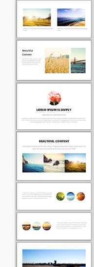
我们全新的拖放式编辑器是打造精美响应式内容的最佳选择。请查看右侧的示例片段。将这些片段拖放到您的内容区域,然后编辑文本、图像和链接。
这些显示组件在窄屏幕上会自动调整自身,形成美观的堆叠布局。
通用响应式内容
系统生成的所有内容均已针对移动响应式布局进行优化。这包括:
- 弹出式幻灯片最大宽度为 95%。
- 购物车和结账页面
- 查询表格
- 会员申请表
如果您发现任何系统生成的内容在响应式移动模板中显示不正确,请告知我们,我们将尽快修复。
调整 CSS 使其适应移动设备
如果你懂技术,你可能想直接修改现有模板,使其变为 CSS 响应式模式。
在样式表中查找尺寸最大的为 600px、750px 或 900px 的行:
#container { width: 750px; margin: 0 auto; }
并将它们更改为这样,使其占据屏幕宽度的 90%,最大可达 960。
#container { width: 90%; max-width: 960px; margin: 0 auto; }
然后找到列,将它们的宽度或边距从固定宽度更改为百分比宽度,但仅在屏幕宽度允许的情况下应用这些宽度。当屏幕宽度小于 600 像素时,列将堆叠在浏览器的整个宽度上。
@media (min-width: 600px) { .leftColumn { width: 20%; float: left; }
本页之前的笔记:
是的,我们所有的网站都会自动针对所有常见的移动设备格式显示移动优化版本。
所有桌面模式下的杂乱元素都会被隐藏,重点突出内容和主要导航。默认选项是一个独立的“移动模板”,它会渲染与桌面版相同的所有内容,并使用相同的站点地图。默认情况下,移动模板界面简洁,即使在小屏幕上也能轻松使用大手指进行导航。
- 所有列表和图库都转换为易于点击的元素。
- 图片尺寸与屏幕大小相符。
- 主菜单可通过右上角的简单“菜单”按钮访问,或滚动到页面底部访问。
- 所有页面的末尾都提供搜索框。
- 我们在高分辨率手机(720像素)屏幕上将文本和输入字段的尺寸增加了一倍。
- “完整网站”按钮会将用户带回桌面版体验。
- 您可以使用自己的自定义模板进一步自定义默认移动模式,或者插入横幅、颜色和样式。
- 关闭移动模式,在所有设备上显示桌面版(适用于简单的桌面布局)
- 禁用移动模式并构建您自己的响应式 CSS 模板
- 关闭移动模式,并从我们的模板库中选择一个响应式设计(搜索关键词“响应式”)。
- 移动模式不适用于 iPad 或大尺寸设备,这些设备更适合全屏显示。但您可以根据自己的响应式规则进行修改。
- 通过移动设备查看试用网站时,移动模板模式不会自动启用,但您可以通过 CMS 中的设计选项、移动模板、查看移动模式来查看试用模式。
- 移动模板模式与您的实时域名相连,如果启用,并且与已知的手机类型列表匹配,它将自动将这些手机重定向到同一基础域名上的移动模式。
- 在移动模式下,已发布的页面将被忽略,所有列表和菜单都将引导您进入一个实时动态页面,该页面在移动设备上的渲染效果会更好。
- 页面内容中的链接可以重定向到已发布页面的版本(桌面模式下不会)。
- 我们的移动模式的优势在于,即使您身处老旧的 2G 网络覆盖区域,内容也能在所有移动设备上快速下载和渲染。此外,我们的移动模式不会像其他模式那样包含 30 个您根本用不到的 JavaScript 文件。
- 我们始终致力于为客户提供最佳用户体验,让他们无需在购物车结算过程中反复缩放即可完成购买。因此,我们尽可能减少了移动模式下使用的特效。