モバイルエクスペリエンスを重視したウェブサイトを作るには、いくつかの方法があります。
- レスポンシブモバイルウェブサイトテンプレート(推奨)
- 専用モバイルウェブサイトテンプレート
- 完全に独立したモバイルウェブサイト
レスポンシブモバイルウェブサイトテンプレート
レスポンシブテンプレートは、Webデザイン業界で人気の高いアプローチです。これは、すべてのCMSが専用のモバイルテンプレートオプションを提供しているわけではないためです。レスポンシブデザインとは、テンプレートがブラウザの幅に応じて形状が変化するように特別に設計されていることを意味します。レスポンシブテンプレートは、各要素を個別に設計する必要があるため、ユーザー自身で編集するのが難しい場合があります。
例えば、メニューは縮小されたり、ページ外に移動されたり、必要に応じて自動的に表示されることがあります。レスポンシブウェブサイトは、モバイルデバイスではダウンロードが遅くなる傾向があります。これは、モバイルデバイスがデスクトップ版で使用されているスタイルやテーマをすべてダウンロードする必要があるためです。モバイル版では使用されていない場合でもです。一部のウェブデザイナーは、見栄えの良いテンプレートの作成に重点を置きますが、ダウンロード速度の問題を忘れがちです。
観光客向けのウェブサイトの場合、顧客は外出先で携帯電話の電波が届かない場所にいる可能性があり、モバイルエクスペリエンスに不要な追加のJavaScriptやCSSライブラリをすべてダウンロードするのに苦労する可能性があります。レスポンシブテンプレートはダウンロードに時間がかかることがよくありますが、私たちは新しいレスポンシブテンプレートを可能な限り高速化するために尽力しており、平均的なWordPressテーマよりも約3倍速くレンダリングされます。レスポンシブウェブサイトは、さまざまな色、フォント、画像でカスタマイズできます。
専用モバイルウェブサイトテンプレート
モバイル専用ウェブサイトテンプレートは、すべてのデスクトップウェブサイトに下位互換性を提供し、お客様にモバイルエクスペリエンスを提供するための従来の方法です。モバイルテンプレートは、デスクトップウェブサイトと同じナビゲーションサイトマップとコンテンツを使用します。ただし、不要な要素はすべて削除し、お客様が必要な情報にすぐにアクセスできるようにしました。例えば、連絡先情報に移動したり、地図リンクを表示したり、小さな画面でも簡単に商品を閲覧して購入したりできます。また、バナーやロゴを追加し、デスクトップテンプレートの色を自動調整する機能も備えています。モバイル専用テンプレートのデザインを微調整することで、お客様に素晴らしいエクスペリエンスを提供できます。この方法は、 最速のオプション 低速の地方モバイル接続を使用している顧客向け。
完全に独立したモバイルウェブサイト
ウェブサイト全体をモバイル専用に構築すると、最初は非常に優れたモバイルエクスペリエンスを実現できるかもしれませんが、多くの場合、ウェブマスターがメンテナンスを怠ったり(あるいはメンテナンスできなくなったり)、各ウェブサイトの情報が同期されなくなることがあります。オンラインショッピングサイトを運営している場合は、モバイルエクスペリエンスとデスクトップエクスペリエンスの両方を同じショッピングカートエンジンで実現する必要があります。そのため、このアプローチはお勧めしません。
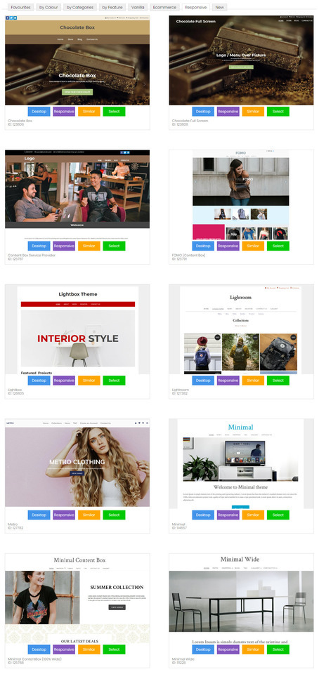
最も人気のあるテーマ
Metroテンプレートは現在、ユーザーの皆様に最も多く選ばれているテーマです。シンプルな白い背景と大きく美しい画像で、見栄えの良いウェブサイトを作成できます。
最小限のテンプレート ID: 114657 は、専用のモバイル モードでもレスポンシブ モードでもほぼ同じ外観になります。
テンプレートの範囲
当社のレスポンシブ テンプレートは、大画面では幅広く、小画面ではちょうどよく、最小のモバイル画面でも高速かつ美しく表示されます。
当社のレスポンシブ テンプレートは、お客様によってカスタマイズできます。
- アニメーションバナー
- ロゴまたは会社名
- ドラッグ アンド ドロップ エディタとコンテンツ ボックス エディタを使用したリッチ コンテンツのフォーマット
- 背景画像、色、またはテクスチャ
- すべての色を選択可能
- カスタムフォント、サイズ、行間隔
既存のウェブサイトをレスポンシブテンプレートに変換する方法
豊富なレスポンシブテンプレートをご用意しており、お選びいただけます。テンプレートは常に更新されています。レスポンシブテンプレートに変更すると、デスクトップとモバイルの両方のレイアウトが更新されます。
- CMSでデザインタブに移動します
- テーマの変更を選択
- すべてのテーマをご覧になり、「レスポンシブ」または「モバイル」ボタンに注目してください。このボタンをクリックすると、どちらのモードでもテーマをプレビューできます。レスポンシブボタンがあるテーマのみがレスポンシブテンプレートです。
- 続行するにはテーマを選択してください。
- 既存のブランド要素をそのままにしたい場合は、バナー、ロゴ、背景、色を変更するためのボックスのチェックを外します。
- 万が一問題が発生した場合に備えて、古いデザイン設定をバックアップするには、ボックスにチェックを入れてください。
- テーマの変更を保存します。
- テーマ変更後にウェブサイトをプレビューすると、ブラウザのキャッシュ設定により正しく表示されない場合があります。ウェブサイトが正しく表示されるようにするには、「公開」してブラウザのキャッシュをクリアする必要があるかもしれません。
- テンプレートによってはデフォルトの色が用意されているものもあれば、用意されていないものもあるため、メニューなどの色設定を再度適用する必要がある場合があります。また、色の組み合わせがテンプレートとすぐには互換性がなく、微調整が必要になる場合もあります。
新しい専用モバイルテンプレートの選択方法
専用のモバイル テンプレートが 8 種類ありますが、それぞれデスクトップ テーマの色とフォントが使用されます。
- CMSでデザインタブに移動します
- モバイルテンプレートを選択
- 新しいモバイルテーマを選択をクリック
- すべてのテーマをご覧になり、「レスポンシブ」または「モバイル」ボタンに注目してください。このボタンをクリックすると、どちらのモードでもテーマをプレビューできます。レスポンシブボタンがあるテーマのみがレスポンシブテンプレートです。
- 続行するにはテーマを選択してください。
- 既存のブランド要素をそのままにしたい場合は、バナー、ロゴ、背景、色を変更するためのボックスのチェックを外します。
- 万が一問題が発生した場合に備えて、古いデザイン設定をバックアップするには、ボックスにチェックを入れてください。
- テーマの変更を保存します。
- テーマ変更後にウェブサイトをプレビューすると、ブラウザのキャッシュ設定により正しく表示されない場合があります。ウェブサイトが正しく表示されるようにするには、「公開」してブラウザのキャッシュをクリアする必要があるかもしれません。
- テンプレートによってはデフォルトの色が用意されているものもあれば、用意されていないものもあるため、メニューなどの色設定を再度適用する必要がある場合があります。また、色の組み合わせがテンプレートとすぐには互換性がなく、微調整が必要になる場合もあります。

モバイルレスポンシブコンテンツのヒント
モバイルデバイスで最高のユーザーエクスペリエンスを実現するには、コンテンツもモバイルレスポンシブに対応する必要があります。多くのお客様は、画像やテキストを配置するために、行と列を多く含む複雑な表構造を作成するために、従来のTinyMCEエディタモードを使用してきました。このようなレイアウトは、画面幅の狭い画面に自動的に調整されず、コンテンツの一部が欠けたり、スクロールバーを使ってアクセスする必要が生じたりします。
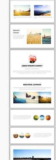
美しくレスポンシブなコンテンツを作成するための最高のコンテンツエディタは、新しいドラッグ&ドロップエディタです。右側にスニペットが表示されています。これらのスニペットをコンテンツエリアにドラッグ&ドロップし、テキスト、画像、リンクを編集してください。
これらの表示ウィジェットは、狭い画面上では美しいスタックレイアウトに自動的に調整する方法をすでに知っています。
一般的なレスポンシブコンテンツ
システム生成コンテンツはすべて、モバイルレスポンシブレイアウト向けに最適化されています。これには以下が含まれます。
- ポップアップスライドショー 最大幅95%
- ショッピングカートとチェックアウトページ
- お問い合わせフォーム
- 会員登録フォーム
レスポンシブなモバイル テンプレートで適切に表示されないシステム生成コンテンツが見つかった場合は、お知らせください。できるだけ早く修正いたします。
CSS を微調整してモバイル レスポンシブにする
技術に詳しい場合は、既存のテンプレートを CSS レスポンシブ モードにハッキングするだけでよいかもしれません。
スタイルシート内で、最大寸法が 600 ピクセル、750 ピクセル、または 900 ピクセルの行を探します。
#コンテナ { 幅: 750px; マージン: 0 自動; }
そして、これを次のように変更すると、画面幅の 90% が最大 960 まで満たされます。
#コンテナ { 幅: 90%; 最大幅: 960px; マージン: 0 自動; }
次に、列を探し、幅または余白を固定幅から%幅に変更します。ただし、画面幅がサポートしている場合のみ、これらの幅を適用します。画面幅が600px未満の場合、列はブラウザの幅いっぱいに重ねて表示されます。
@media (最小幅: 600px) { .leftColumn { 幅: 20%; フロート: 左; }
このページの前のメモ:
はい、当社のすべてのウェブサイトでは、一般的なすべてのモバイル形式に合わせて、ウェブサイトのモバイル向けに最適化されたビューが自動的に表示されます。
デスクトップモードの不要な要素はすべて非表示になり、コンテンツと主要なナビゲーションに焦点が当てられます。デフォルトのオプションは、デスクトップ版と同じサイトマップを使用して、同じコンテンツをすべてレンダリングする別の「モバイルテンプレート」です。デフォルトのモバイルテンプレートはシンプルで、小さな画面でも大きな指で簡単に操作できます。
- すべてのリストとギャラリーは、簡単にクリックできる要素に変換されます。
- 画像は画面サイズ内に収まります。
- メイン メニューには、右上にあるシンプルな 1 つの [MENU] ボタンから、またはページの最後までスクロールしてアクセスできます。
- すべてのページの最後に検索ボックスがあります
- 高解像度の携帯電話720ピクセル画面でテキストと入力フィールドのサイズを2倍にしました
- 「フルサイト」ボタンをクリックすると、ユーザーはデスクトップ エクスペリエンスに戻ります。
- 独自のカスタム テンプレートを使用してデフォルトのモバイル モードをさらにカスタマイズしたり、バナーや色、スタイルを挿入したりできます。
- モバイル モードを無効にして、すべてのデバイスでデスクトップ バージョンを表示します (シンプルなデスクトップ レイアウトに適しています)
- モバイルモードを無効にして、独自のレスポンシブCSSテンプレートを作成します。
- モバイルモードを無効にして、テンプレートの範囲からレスポンシブデザインを選択します(レスポンシブキーワードを探してください)
- モバイル モードは、フル スクリーン表示が推奨される iPad や大型デバイスでは使用されません。ただし、独自のレスポンシブ ルールを使用してこれを変更することは可能です。
- モバイル経由でトライアルサイトを表示する場合、モバイル テンプレート モードは自動的には表示されませんが、CMS の「デザイン オプション」、「モバイル テンプレート」、「モバイル モードの表示」からトライアル モードを表示できます。
- モバイル テンプレート モードはライブ ドメインに接続され、有効になっている場合、既知の携帯電話の種類のリストと一致すると、同じベース ドメイン上のモバイル モードに自動的にリダイレクトされます。
- 公開されたページはモバイル モードでは無視され、すべてのリストとメニューは、モバイルでより適切にレンダリングされるライブの動的ページに誘導します。
- ページのコンテンツ内の公開ページへのリンクは、公開バージョンにリダイレクトされる場合があります (デスクトップ モードではリダイレクトされません)。
- モバイルモードの利点は、たとえ古い2Gの通信エリア内にいても、あらゆるモバイルデバイスでコンテンツのダウンロードとレンダリングが高速であることです。モバイルモードには、実際には使わない30個のJavaScriptインクルードファイルなどは一切ありません。
- 私たちの最大の目標は、ショッピングカートのチェックアウト手続き中に何度もズームイン・アウトすることなく、お客様に最高のユーザーエクスペリエンスを提供することです。そのため、モバイルモードで使用するエフェクトは最小限に抑えています。