
Hi [FIRSTNAME]
This edition of website.world news is dedicated to Mobile Responsive Websites.
- All about Mobile Responsive Websites.
- Our Most Popular Theme: Minimal
- How to upgrade to a mobile responsive template
- New dedicated mobile template layouts
- Tips on Mobile Responsive Content
- Tweaking your CSS to be Mobile Responsive.
- August Promotion: Win $4500 Busines Makeover Package
- Awesome Updates and New Features
- Professional mobile website upgrade - only $100
- 100% Up Time
- Need training?
- Clearing your browser cache
- Better Broadband & 0800 telephone numbers
- 25% discount on hosting
- Start your own business - reseller options
- Cool links/system links
- Websites of the month
All about Mobile Responsive and Dedicated Mobile Websites
There are a few different ways to make your website more awesome for mobile users
- 专用移动网站模板
- Responsive Mobile Website Template
- 完全独立的移动网站
专用移动网站模板
A dedicated mobile website template is the traditional way we have provided backward compatibility for all our desktop website templates to offer your customers a better mobile experience. The mobile template uses the same navigational sitemap, and same content as your desktop website. However, we trimmed off all the unnecessary clutter to ensure your customers could quickly get to the information they want. For example, navigate to your contact details, view a map link, or view your products and make a purchase easily on their small screens. Over time we have added banners, logos and auto matched the colours to your desktop template. With fine tuning to your dedicated mobile template design, your customers will have an awesome experience, as this method is the最快的选择 for customers using slow rural mobile connections. Dedicated mobile templates are usually 3 times faster to load than a responsive template, and 10 times faster than the average WordPress template.
响应式移动网站模板
Responsive templates are a popular approach in the web design industry, because not every CMS can provide a dedicated mobile template option. Responsive design means that the template has been specially crafted to change shape in different browser widths. Responsive templates can be difficult for users to edit themselves, as each element needs to be especially crafted. For example, menus might be condensed, or relocated off page, and pulled in when needed. Responsive websites tend to be slower to download on mobile devices, as the mobile device needs to download all the styles/themes that are used in the desktop version, even if not used in the mobile version. Some web designers focus on making great looking templates, but they forget about these download speed issues. If your website is tourist oriented, your customers may be out and about on the edges of mobile phone coverage, and they might have trouble downloading all the additional JavaScript and CSS libraries that are not required for the mobile experience. Responsive templates are often slow to download, but we have been working hard to make our new responsive templates as fast as they can be, and our responsive templates will render about 3 times faster than the average WordPress theme. Our responsive websites can be customised with different colours, fonts, and images.
完全独立的移动网站
专门为移动设备打造的网站或许一开始能带来非常好的移动体验,但网站管理员往往会忘记维护(或者根本无力维护),导致两个网站的信息不同步。如果您运营的是在线购物网站,那么您的移动端和桌面端体验必须使用同一个购物车引擎。我们建议客户不要采用这种做法。
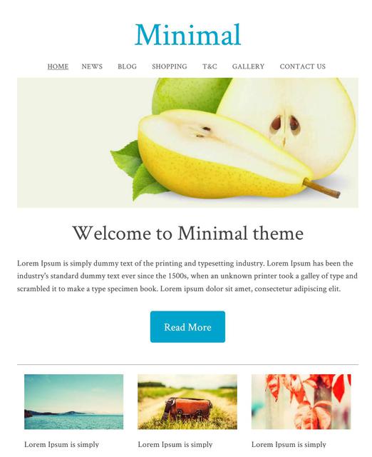
我们最受欢迎的主题
The minimal template range is currently the most popular theme selected by our users. With a simple white background, and a big beautiful images, you can create a great looking website, and choose your own fonts and colours for the text, headings, and buttons.
最小模板 ID:114657 在专用移动模式或响应式模式下外观几乎相同。
All New Responsive Templates
We have upgraded lots of our old templates to be all new responsive templates, wide on big screens, just right on small screens, and fast and beautiful on the smallest of mobile screens. These are available under the dedicated "Responsive" tab.
您可以自定义我们的响应式模板:
- 动态横幅
- 标志或公司名称
- 背景图像、颜色或纹理
- 所有颜色均可选择
- 自定义字体、字号和行距
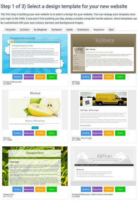
如何将现有网站转换为响应式模板
我们提供多种响应式模板供您选择,并且会不断更新。切换到响应式模板后,您的桌面和移动设备布局都会同步更新。
- 在内容管理系统中,转到“设计”选项卡
- 选择“更改主题”
- 浏览所有主题,并留意“响应式”或“移动端”按钮。点击此按钮即可预览主题的响应式或移动端版本。只有带有“响应式”按钮的主题才是响应式模板。
- 选择一个主题继续。
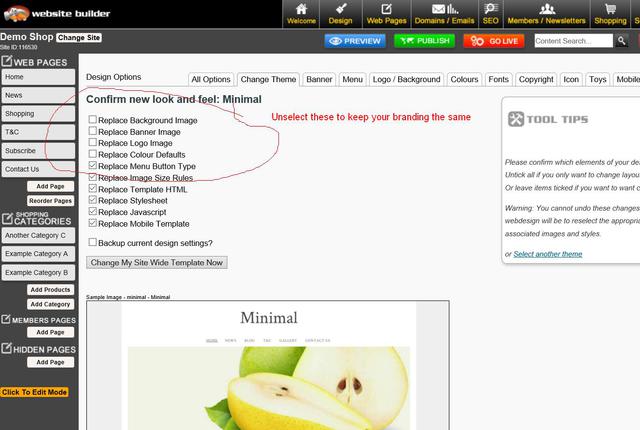
- 如果您想保持现有品牌元素不变,请取消勾选更改横幅、徽标、背景和颜色的复选框。
- 勾选此框以备份您的旧设计设置,以防万一出现问题。
- 保存主题更改。
- 有时,由于浏览器缓存设置,在更改主题后预览网站时,网站可能显示不正确。您可能需要发布网站并清除浏览器缓存,才能看到正确的显示效果。
- 有时您可能需要重新应用菜单等的颜色设置,因为有些模板提供默认颜色,而有些模板不提供,或者您的颜色组合可能与模板不兼容,需要进行一些微调。
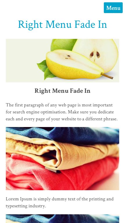
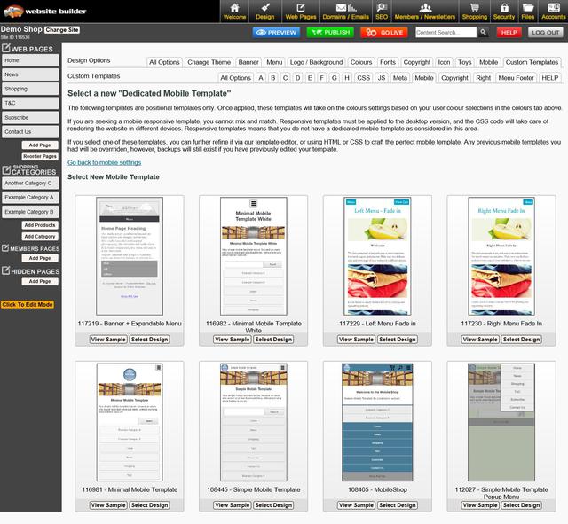
Dedicated Mobile Option - New Templates
The minimal template is one of our most popular, and it has a responsive look that many like. We have also added the same look to our dedicated mobile themes. It has a menu that fades in from the right when you press the MENU button.
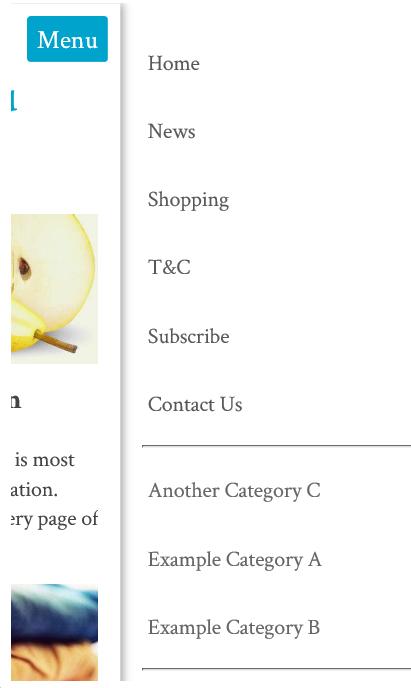
如何选择新的专用移动模板
我们有 8 款不同的专用移动模板,但每款模板都会使用您桌面主题的颜色和字体。
- 在内容管理系统中,转到“设计”选项卡
- 选择移动模板
- 点击“选择新的手机主题”
- 浏览所有主题,并留意“响应式”或“移动端”按钮。点击此按钮即可预览主题的响应式或移动端版本。只有带有“响应式”按钮的主题才是响应式模板。
- 选择一个主题继续。
- 如果您想保持现有品牌元素不变,请取消勾选更改横幅、徽标、背景和颜色的复选框。
- 勾选此框以备份您的旧设计设置,以防万一出现问题。
- 保存主题更改。
- 有时,由于浏览器缓存设置,在更改主题后预览网站时,网站可能显示不正确。您可能需要发布网站并清除浏览器缓存,才能看到正确的显示效果。
- 有时您可能需要重新应用菜单等的颜色设置,因为有些模板提供默认颜色,而有些模板不提供,或者您的颜色组合可能与模板不兼容,需要进行一些微调。
移动响应式内容制作技巧
如果您想为移动设备提供最佳用户体验,您的内容也需要具备移动响应式设计。许多客户曾使用我们旧版的 TinyMCE 编辑器模式创建复杂的表格结构,其中包含大量行和列,以便精确布局图像和文本。这种布局无法自动适应小屏幕宽度,部分内容可能会被裁剪或需要滚动条才能访问。
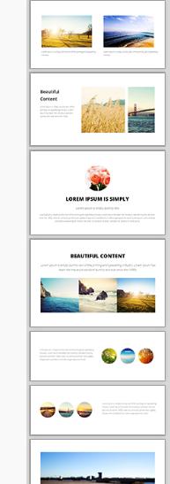
我们全新的拖放式编辑器是打造精美响应式内容的最佳选择。请查看右侧的示例片段。将这些片段拖放到您的内容区域,然后编辑文本、图像和链接。
这些显示组件在窄屏幕上会自动调整自身,形成美观的堆叠布局。
通用响应式内容
All of our system generated content has recently been optimised for mobile responsive layouts by default, avoiding the need to specifically optimize each template individually. This includes:
- 弹出式幻灯片最大宽度为 95%。
- 购物车和结账页面
- 查询表格
- 会员申请表
如果您发现任何系统生成的内容在响应式移动模板中显示不正确,请告知我们,我们将尽快修复。
调整 CSS 使其适应移动设备
If you are technically minded, you might like to just hack your existing template into CSS responsive mode without breaking everything else that has been especially crafted.
在样式表中查找尺寸最大的为 600px、750px 或 900px 的行:
#container { width: 750px; margin: 0 auto; }
并将它们更改为这样,使其占据屏幕宽度的 90%,最大可达 960。
#container { width: 90%; max-width: 960px; margin: 5% auto; }
然后找到列,将它们的宽度或边距从固定宽度更改为百分比宽度,但仅在屏幕宽度允许的情况下应用这些宽度。当屏幕宽度小于 600 像素时,列将堆叠在浏览器的整个宽度上。
@media (min-width: 600px) { .leftColumn { width: 20%; float: left; }
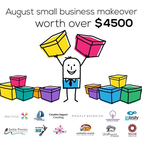
Promotion:
Last day - ends tomorow:
We've joined up with 11 other service providers to bring you this AMAZING GIVEAWAY worth $4500!!
Awesome Updates and New Features
- Directory Widget - Now has 5 categories per listing
- Photo Shopping Cart - you can now search for photos by keyword or private gallery code.
- Most 3 and 4 column thumbnail layouts have been upgraded to 320x320 sized thumbnails. Higher quality images do increase the download time and traffic, but look better on our new wider format templates
- New training videos

Professional Mobile Upgrade
Only $100+gst
Professional mobile upgrade service. (RRP: $299)
Need Professional Help For To Make Your Existing Website Mobile Responsive?
It's possible you may break some elements of your website if you attempt to change the template on a live website.
Our in house web designers are keen to help you update your old website to a modern new responsive look. Normally we would charge $250 for that sort of upgrade. If you go ahead before end of August, we will do your mobile upgrade for just $100+gst

100% Website Up Time
We have returned to our 100% up time winning streak, after the outage in June destroyed our year long march in the 100% zone. June was a low 99.85% up time due to that big Sydney storm.
Over the last 2 months we have performed many system upgrades to make our hosting service more robust and deal more gracefully with outages in specific geographical locations.
Uptime stats provided by Pingdom.com
Need one-on-one Website Builder Training?
If you require personalised training, please contact one of our consultants, who are based all over. Several consultants also provide over the phone and web based training at a scheduled time.
We would encourage all customers to get at least one hour of training at the early stages of building their website, and one more review prior to going live, just to give your website that professional critique, and quick tidy up of the rough bits.
Training topics include:
-
How to use website builder and shopping cart
-
How to design websites
-
How to crop and tidy up photos
-
How to optimise to get your website higher on google and other search engines
-
How to setup a facebook page, or other social media account
-
How to send newsletters
-
How to use any other feature we offer.
Clearing your Browser Cache and Publishing
Caching speeds up your computer, but it also causes confusion when viewing changes to your website. Every web master needs to become familiar with this concept. Almost a third of all our support tickets relate to mis understandings about caching. We can't change the nature of the internet, we only educate.
- Pressing publish button is neccesary even before you go live. Pressing the publish button allows you to navigate your trial website. When you navigate your trial website, you are actually navigating the published pages in many cases. Only the first page to preview in preview mode usually shows your recent changes.
- Your web browser is not aware that you are currently editing your website. The web browser does not undersstand any connection between our website builder CMS, and your website with a completely different URL. You typically need to press REFRESH on your browser to see recent updates. Or you may even need to clear your browser cache.
All New Training Videos
Andrew has been busy making some awesome new training videos, to show you just how easy it is to do some amazing things. If you want him to make more great videos, please email support telling him what a great job he's doing, and what you would like to know more about.

Better Broadband (NZ Customers)
We have teamed up with the awesome ISP's to offer you some great broadband options. If you have become disgruntled with your current isp, now is the time to get a great bundled broadband offering, including the following ISPs
- MyRepublic
- 2Talk
- BigPipe
https://www.websitebuilder.world/listing/nz-broadband-providers
0800 Numbers and Cheaper Tolls (NZ Customers)
Do you need an 0800 number for your business? We think 2talk provide a really awesome service, and it's who we use. For example, you have an 0800 number call your landline first, then your mobile, then your 2IC's mobile to ensure that somone will take the call. Their rates are cheap, and all the value added services can be managed via a web page control panel, so you don't need to wait on hold for any call centers. You can manage your lines fully yourself.
Receive a 25% discount off your web hosting, for life, by referring a friend
Did you know that if you refer a friend to use our awesome website builder service, you get a 25% discount off your hosting? If you refer 4 friends, then you will essentially get your web hosting for free! Not only that, but your friends will also get their 2nd month web hosting absolutely free. That's a nice little encouragement for them to check our service out and gives us the opportunity to setup your discount. Both discounts apply for your 2nd and subsequent websites also. It doesn't matter if it is yours, a friend, family or a stranger. Discounts begin once both websites are live. Please make sure you or your friend communicates the referral at the earliest opportunity.
经销商选项
We have an awesome new offer for web designers and awesome business networkers. We can setup any web designer who is interested with all they need to get started as a web designer at no cost:
- There are no setup fees, no contracts to sign.
- You will earn $2+ on every domain name sold (based on RRP $19 per year).
- You will earn (25%-50%) commission on hosting
- You can manage all your customers content, domains, emails etc, easily from just 1 login.
- We take care of all the billing arrangements, so no administrative hassle.
Need Help! is at hand...
There are several places you can find answers to questions about how to build your website and add features (which, there are a lot of) and its free for you to look:
If you can't find the answer you need - then get you can Contact - Web Designers or lodge a Support ticket
Cool links
- http://www.wikihow.com/Clear-Your-Browser's-Cache - Clear your browser cache
-
http://word2cleanhtml.com - Cleans word docs for CMS Editor
-
GoogleFonts - Online Web Fonts
-
http://pinterest.com/ - A social networking Pin Board
-
http://pixlr.com/ - online photo editor
-
http://www.photoshop.com - online photo editor
-
http://www.jotform.com/ - online form builder
-
www.needanerd.co.nz - NZ Wide IT Nerds
-
www.geeksonwheels.co.nz - NZ Wide IT Geeks
-
https://www.pexels.com/ - Free Stock Photos
-
www.ninite.com - absolutely the best way to install new software on a new computer
-
www.2talk.co.nz - cheaper VOIP calling and 0800 incoming call routing
All those links and more at our new toolbox page:
Websites of the month
Here's a selection of some of our recent Go Lives.
- http://www.teamtees.org.nz
- http://www.epicdota.com
- http://www.thebedstore.co.nz/
- http://www.TrueWesternWear.nz
- http://www.myfastcash.co.nz
- http://www.nzspp.co.nz
- http://www.H2OBlastingChristchurch.co.nz
- http://www.codexedit.com
- http://www.maternitysupportandeducation.co.nz
- http://www.alphamews.co.nz
- http://www.gideonsnz.org
- http://www.lahmanenergy.co.nz
- http://www.poolcaretech.co.nz
- http://www.furnacc.com
- http://www.myersecology.kiwi
- http://www.veaimagesolutions.co.nz
- http://www.rcparts.co.nz
- http://www.donsdiscounttyres.co.nz
- http://www.rjsscaffoldhire.co.nz
- http://www.asiltd.co.nz
- http://www.karatefudokan.co.nz
- http://www.silversky.co.nz
- http://www.webworkx.co.nz
- http://www.summitlodge.co.nz
- http://www.letsgoparty.co.nz
- http://www.standingtrialpopulations.nz
- http://www.rainbowfish.co.nz
Please 联系我们 for more information.
From the Team @ Web Widgets Ltd
Website World - Free Website Builder
Posted: Mon 15 Aug 2016